INDOOR FOOD MARKET IN RUA AUGUSTA -SAO PAULO (BR)
Konigsberger Vannucchi Arquitetura
Place Sao Paulo, Brazil
Design Leader : Max Strano
The concept is to bring in the elements of the temporariness of the traditional market. Historically the place of the market is the square, which in this case is an inner covered square. Therefore, it was decided to create a continuation with the outer space:
a. The external pavement flow into the internal space creating an extension of the public space in front of it
b. The insertion of the lateral access staircase to the residential building within the internal space allowed us to recreate multiple levels, emphasizing the initial principle of having a morphologically dynamic space
c. The interior furniture was designed to consist of “closed” and finished elements that can be distinguished from the rest of the furniture using recognizable and self-supporting shapes in bright colours
d. The “hinge” of this intervention is the Bar-Caffe on the atrium which effectively transforms the space into a covered square. The use of the bar was also envisaged even when the food hall is closed by a counter on the outside to take up the concept of the kiosk, typical of the historic market square.
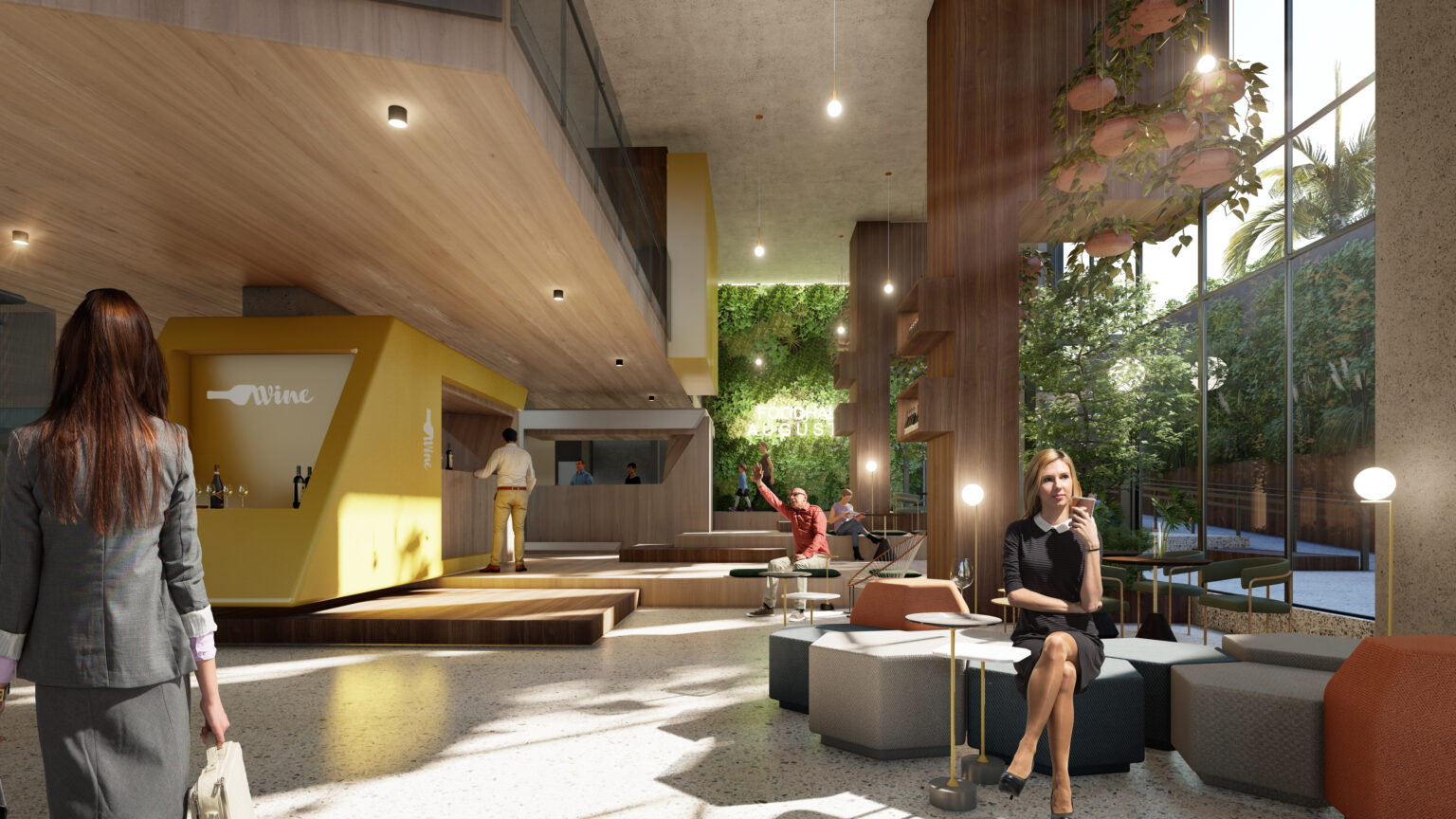
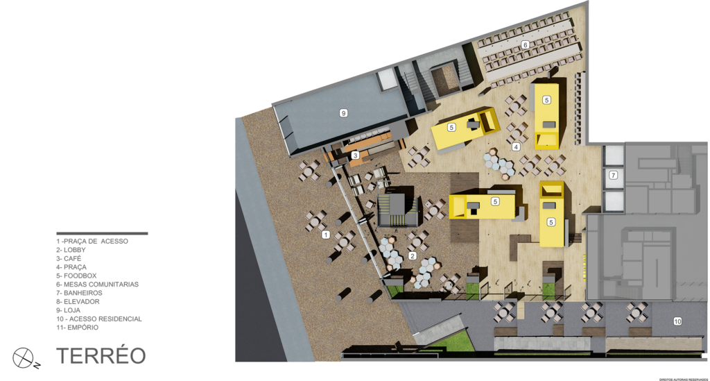
The characterizing elements of the plant are “self-sufficient” boxes that are inspired a little by the principle of containers. They take up a little of the size but the shape has been changed, preferring a more dynamic one that is relevant to the needs of the project.
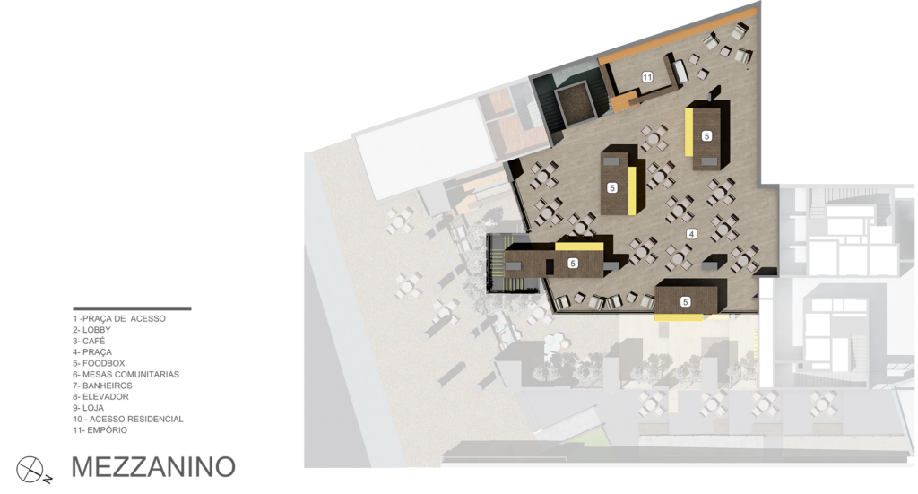
The space has 4 internal zones:
1. The entrance with the waiting area, relaxation area, bar and the staircase connecting to the mezzanine.
2. The raised central part with the sales boxes designed as representative of different kitchens and cultures. In a cosmopolitan city like Sao Paulo, it could be interesting to have a place where different flavours can be concentrated.
3.A multi-level area, designed as an internal square where it was possible to stay at the tasting and be organized as a space for meetings, seminars, debates etc.
4. The mezzanine where other product sales boxes and an organic market have been placed, as well as a bakery shop.
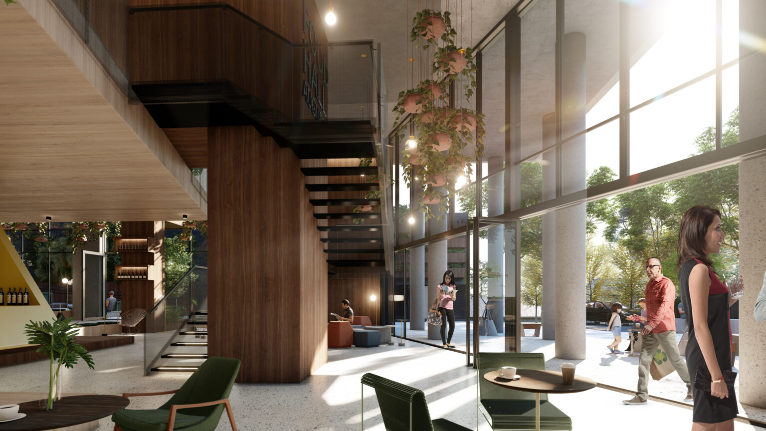
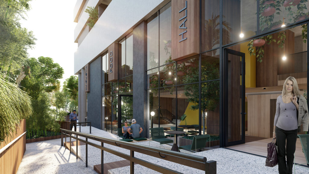
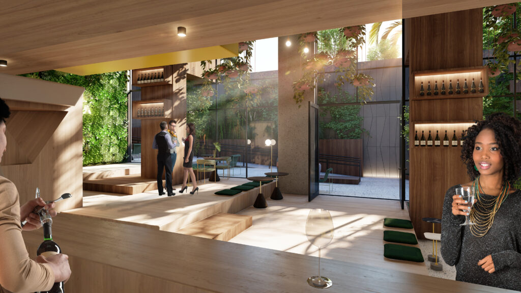
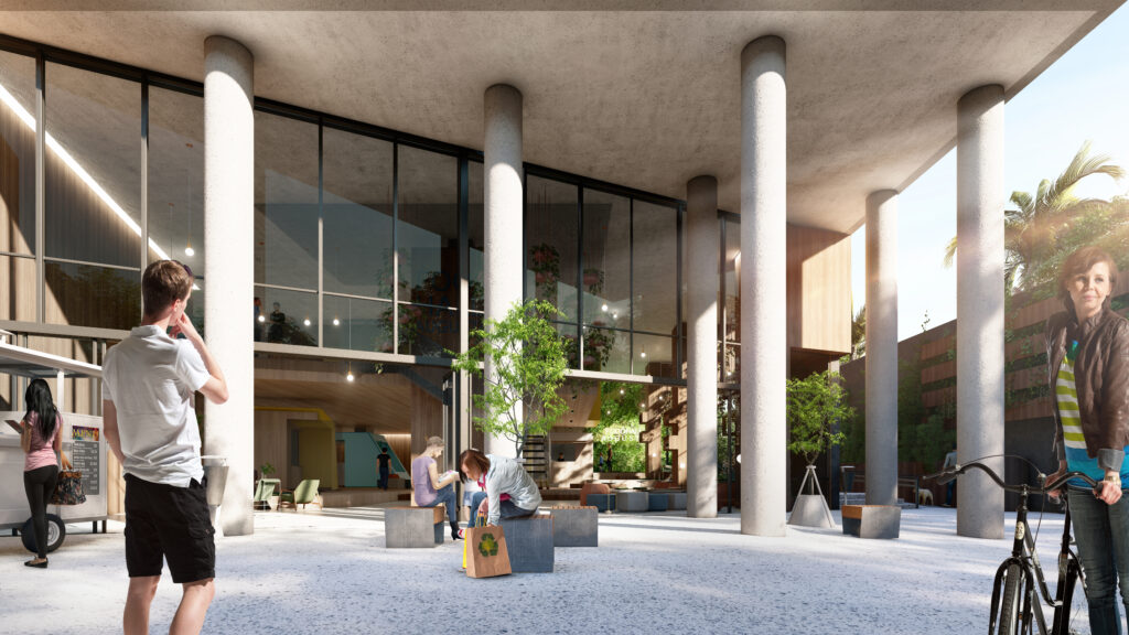
Precious materials were selected but with an urban character: “granilite” for the entrance floor, conceived as an extension of the space in front of the building; smoothed concrete for the remaining part of the space with the use of wood to highlight the jumps in height. The same wood is used for internal carpentry. For the boxes, lacquered wood with different colours was used (these are the elements that mark the project and the space). For the staircase, an industrial solution was adopted with a cantilevered structure and sheet metal cladding. This gives a stage presence and lightness. The same sheet metal was used for the mezzanine railings.
We also proposed a variation of the access to the residential building (on the side of the food hall) by rotating the first connecting ramps and recreating a walk that could provide different points of view and invite side access to the food hall.
In addition, a variation of the facade was proposed to integrate the internal composition with the formal design of the elevation and also allow the integration of the visual communication of the commercial space.
